DTLA Art Walk
|
Role: User Experience & UI / Visual Designer Team: Bobby Araiza Timeframe: 2 Weeks Platform: Website Tools: Sketch, Invision, Photoshop |
DTLA Art Walk intends to bring color and life to the currently dark and simple site. The redesign also highlights the great galleries, memberships, and activities that visitors are able to attend when visiting. Making the website feel like a "mini-experience" before visiting was important.
|
Challenge
|
Redesign and rebranding of the current site. I also focused on providing a new membership signup process. The membership is a solid price at $12 annually, and offers great benefits to its members, I wanted to highlight that.
Note: at the time of publishing this case study, the membership page on the current site has now been removed... meaning they no longer offer memberships. |

×


The New Home Page, click the image above to view the whole page.
The "Whys"
|
Research
I first sought to understand what users thought of the current site. I tested the site on multiple people to find out how well the site flowed, whether they could achieve certain tasks, thoughts on the design, and whether they'd been to any Art Walk events. |
|
Here's what I found: 1. Future dates for the Art Walk are not easily displayed. This should be their main priority. 2. Website lacks any CSS styling. Users I tested did not find the site to be appealing or inviting. 3. A dark and unreadable color palette. Black background with grey text found throughout the site. |
Design System
|
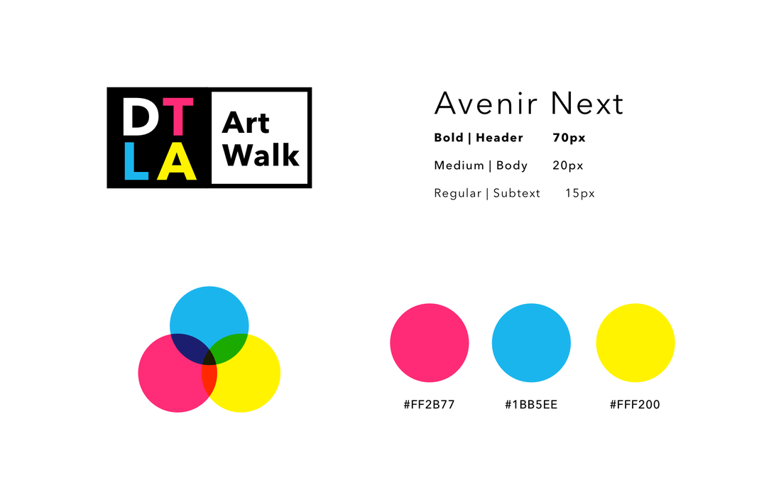
DTLA Art Walk hopes its attendees be filled with art and creativity, surrounded by colors and great pieces of art displayed in various Galleries in the beautiful city. The website should reflect that. After ideating, sketching, testing, and prototyping, I moved on to the design.
The new colors represent the 3 primary colors and more specifically CYM(K). They are meant to be bright, fun, and full of creative versatility. Bring out the "Art" in Art Walk. What's new:
|
Logo
|
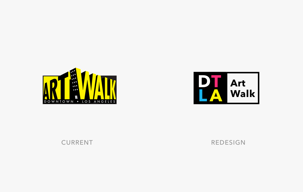
I wanted the new logo to be easy to read, with less clutter and shapes. It was about simplifying the design, and instead taking advantage of the primary colors.
The weights, kerning, and space allows it to be readable from a distance, and is easily recognizable. While the old logo isn't bad, it could be utilized in a different approach, like on merchandise and t-shirts, but don't think it should be their primary logo. |
Elements At A Glance
|
It was important to emphasize the role of the Galleries, Tours, and Memberships in the redesign. The Art Walk is a non-profit and relies heavily on donations and active participation from its attendees.
|
Final Thoughts
|
As an art lover, I love to be able to lose myself in galleries, surrounded by art and the sense of creativity it brings. Combine that with the great city of Los Angeles, and you have a winning recipe. There's a lot of ideas that I bring forth to the table, they can definitely be improved on, but I think this was more to get a good sense of the possibilities to come.
|


